Archive

stork sash windows website design

STORK SASH WINDOWS website

COMPANY


We made website design for very strong sash windows company, which production goes to many countries. Our task was to make unique and specific website design which suits just for oak sash window products.


PROBLEM


There are many competitors in this niche. We analyzed many companies, which produce oak sash windows. Many of these website’s are too crowded and overcrowded by information, banners. Also, some already do not have responsive design what nowadays is pretty amazing too. Our task was to look through these examples, recognize, analyze problems and avoid them in our project.


WEBSITE DESIGN FEATURES


Fully responsive (is an approach to web design aimed at crafting sites to provide an optimal viewing experience — easy reading and navigation with a minimum of resizing, panning, and scrolling — across a wide range of devices (from desktop computer monitors to mobile phones), minimalistic and clean website design.


DESIGN ACCENT


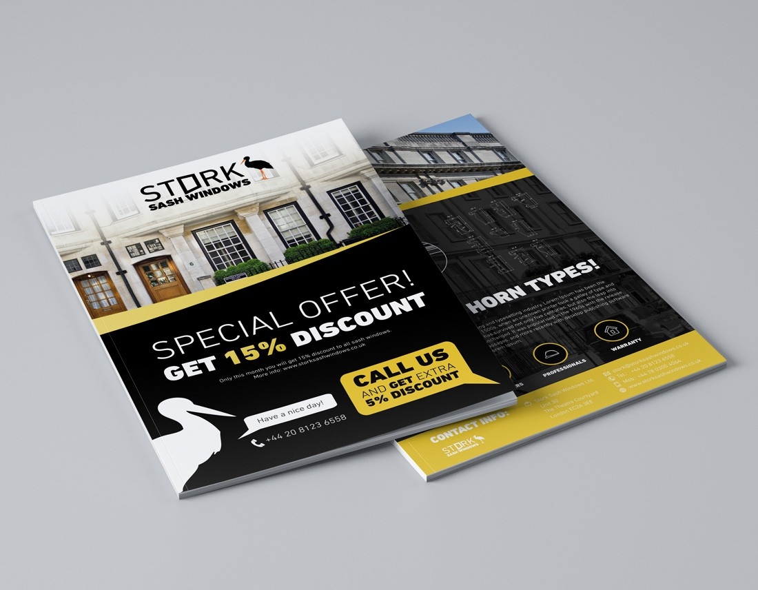
Firstly we wanted to use acorn – stork as the main accent, but our client wanted to show clear message to his clients about his products. Then we decided to take stork icon with full company name – it’s clear and obvious object without any metaphors.


FONT


Font played very strong role to represent old tradition company, which makes high quality products. Our task was to create elegant impression, so we decided to use classic font to create old tradition, clean, elegant website design look.


COLORS


Dominating website design colors – natural green, natural black and white.


CONCLUSION


Firstly we communicated with our client, listened to him, raised all priorities and potential problems above, analyzed many competitors, created website design accent, selected the most suitable fonts and colors and in the end we left our client happy. But forgot to mention… Our client made us happy too, so we became partners. Also, we got good recommendations.

stork e-shop design

STORK INTERIOR e-shop

COMPANY


We made e-shop design for STORK INTERIOR company, which production goes to many countries. Our task was to make unique and specific e-shop design which suits just for interior products.


PROBLEM


There are many competitors in this niche. We analyzed many companies, which produce similar products. Many of these e-shop’s are too crowded and overcrowded by information, banners. Also, some already do not have responsive design what nowadays is pretty amazing too. Our task was to look through these examples, recognize, analyze problems and avoid them in our project.


E-SHOP DESIGN FEATURES


Fully responsive (is an approach to web design aimed at crafting sites to provide an optimal viewing experience — easy reading and navigation with a minimum of resizing, panning, and scrolling — across a wide range of devices (from desktop computer monitors to mobile phones), woocommerce (is the most popular open source e-commerce plugin for WordPress), also good customizability, minimalistic and clean e- shop design.


DESIGN ACCENT


We liked Stork silhouette as the main accent, so did our client. In the end we used those elements in creating e-shop design and logo design.


FONT


Font played very strong role to represent old tradition company, which makes high quality products. Our task was to create elegant impression, so we decided to use classic font to create old tradition, clean, elegant e-shop design look.


COLORS


Dominating e-shop design colors – natural warmth colors, natural brown and white.


CONCLUSION


Firstly we communicated with our client, listened to him, raised all priorities and potential problems above, analyzed many competitors, created e-shop design accent, selected the most suitable fonts and colors and in the end we left our client happy. But forgot to mention… Our client made us happy too, so we became partners. Also, we got good recommendations.